Duy Vu
September 25, 2025
•
20 mins read
You know how dashboards are supposed to be the nerve center of your business? But so often, they gather dust. You build it. Then your team ignores it. That’s not because dashboards are bad — it's because they weren’t built for real use.
In this guide, we’ll walk instead of lecture. You’ll get practical, UX-backed strategies to get your dashboards adopted — plus visuals you can hand off to your design or dev team. (Also: yes, Retoolers can help build them if you want.)
First, let’s call out why many dashboards fail. Because unless you understand the pitfalls, your fixes will miss.
One big trap is overcrowding: dashboards that try to show everything lose impact. Users scroll, scan, and give up. Another is irrelevant data — metrics that aren’t tied to what a person cares about in their day-to-day. If the finance team sees sales rep charts they don’t understand, they're going to ignore it.
Also, many dashboards live outside workflow. You check the report, then you jump into another tool to act. That friction kills adoption. Finally, if the data lags or is broken, users won’t trust it — and once trust is lost, getting it back is nearly impossible.
At Retoolers, we often see clean dashboards built with zero thought for the people who must use them. Fixing that is what separates dashboards people glance at from dashboards they lean on.
Let’s go deep into what actually helps adoption. These are design + UX practices grounded in how humans work.
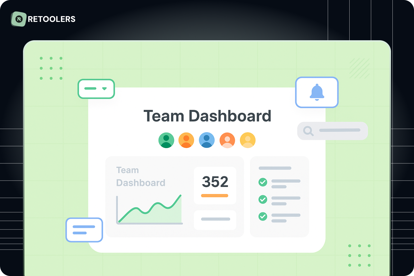
Instead of overwhelming users, surface 3–5 core metrics first — the “North Star” KPIs. Make them prominent. Everything else is supplementary. If someone has to hunt for key numbers, adoption slides.
Every role has different needs. Sales needs a pipeline, support needs tickets by status, ops needs backlog metrics. Build dashboards for them, not for you. When we build dashboards at Retoolers, we always begin by interviewing end-users so the layout fits their flow.
A dashboard isn’t a museum — it’s a tool. If I see a low number, I want to correct, click, or dig deeper. Add buttons, drill-downs, inline edits. If every number is tied to an action, people will lean into your dashboard rather than treat it as just a display.
Guiding the eye matters. Use size, color contrast, spacing to show what’s most important. A dashboard with too many competing visuals feels chaotic. Also, consistent theming (colors, fonts, spacing) helps users feel comfortable and reduces cognitive load. (Hey — this is a great tie-in to your Themes page.)
Release a minimal viable dashboard (MVD). Observe which sections people skip, which filters they use, where they get stuck. Then iterate. High adoption comes from evolving, not perfecting. At Retoolers, most dashboards start with basic layouts, then refine based on real user behavior.
If someone has to leave your dashboard to take action, many will stop using it. Tie dashboards into Slack alerts, email shortcuts, or buttons that trigger real operations. Make it part of how your team works, not a separate destination.
Dashboards are a powerful tool — but only when they work for your team. Focus on clarity, actionability, context, and iteration. Build dashboards people don’t just glance at but depend on.
If you’re ready to get dashboards your team actually uses, Retoolers can help you do it fast. From user research to UI and build — we’ve done it.
Contact us to Get a Quote for dashboard design & build
Looking to supercharge your operations? We’re masters in Retool and experts at building internal tools, dashboards, admin panels, and portals that scale with your business. Let’s turn your ideas into powerful tools that drive real impact.
Curious how we’ve done it for others? Explore our Use Cases to see real-world examples, or check out Our Work to discover how we’ve helped teams like yours streamline operations and unlock growth.
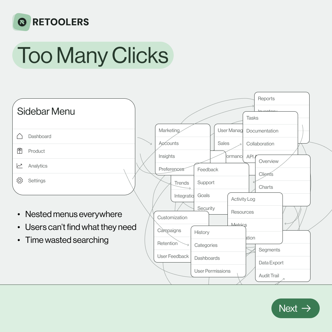
🔎 Internal tools often fail because of one simple thing: Navigation.
Too many clicks, buried menus, lost users.
We broke it down in this 4-slide carousel:
1️⃣ The problem (too many clicks)
2️⃣ The fix (clear navigation structure)
3️⃣ The Retool advantage (drag-and-drop layouts)
4️⃣ The impact (happier teams)
💡 With Retool, you can design internal tools that are easy to use, fast to build, and simple to maintain.
👉 Swipe through the carousel and see how better UX = better productivity.
📞 Ready to streamline your tools? Book a call with us at Retoolers.
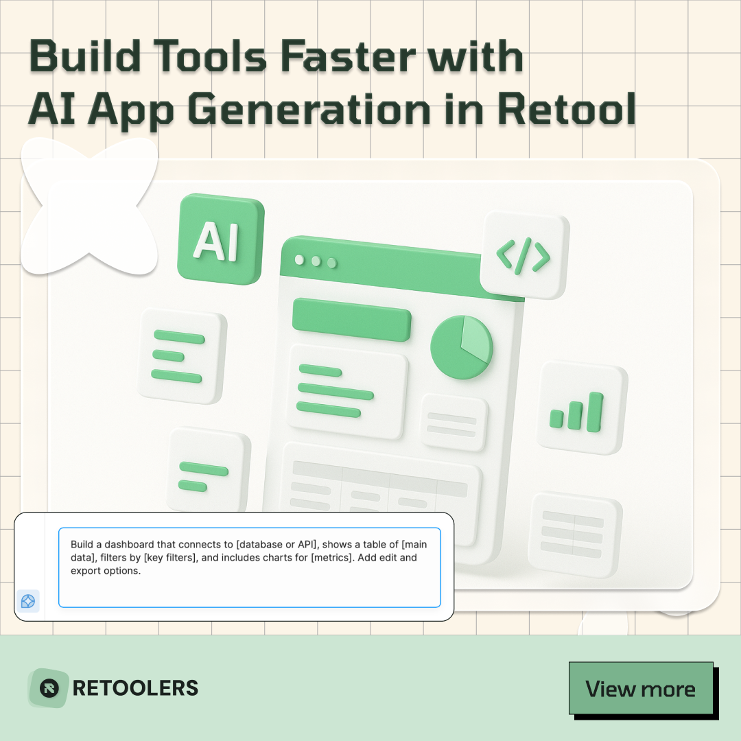
🚀From idea → app in minutesBuilding internal tools used to take weeks.
Now, with AI App Generation in Retool, you can describe what you want in plain English and let AI do the heavy lifting.
At Retoolers, we help teams move faster by combining AI + Retool to create tools that actually fit their workflows.
👉 Check out our blog for the full breakdown: https://lnkd.in/gMAiqy9F
Before we quote, we help you clarify the workflow. Share your idea, process, or existing tools, and we’ll map the key requirements, suggest the right system, and create a free wireframe so you can see the solution before development starts.