Duy Vu
April 8, 2025
•
15 mins read

When you think about building a dashboard, layout and data might be the first things that come to mind — but color is just as important. The right color choices don’t just make your UI look better; they help users make faster decisions, spot trends, and avoid mistakes.
In platforms like Retool, where dashboards are tailored for internal teams, color becomes a tool for communication. Whether you’re designing for an accounting firm, a VC team, or a real estate business, understanding how color impacts usability is key to building dashboards that truly work.
In this blog, we’ll break down how different industries use color, how it shapes user behavior, and how you can apply it to components like notifications, metric cards, and charts. Let’s get into it.
Color is more than just visual flair. In dashboards, color directly affects how users interpret data, prioritize information, and take action. Whether you're designing tools for accountants, investors, or real estate professionals, the color scheme you choose can either elevate the experience or make it harder for users to do their job.
When building dashboards in platforms like Retool, smart use of color improves the interface's clarity and supports fast decision-making. Every shade has a role — and every industry has its own expectations when it comes to visual language.
Color influences mood and behavior. It helps users identify patterns, spot anomalies, and understand urgency without reading a single word. For example, green is often used for success or growth, red for alerts or losses, and blue for stability and trust. These associations aren’t random — they’re tied to user expectations and years of visual conditioning.
But the way you use these colors should also match the industry and user type. Let’s break down how three different industries benefit from intentional dashboard color design.
Accounting dashboards handle a lot of dense information — from tax data to invoices and financial reports. A clean and calm visual structure is essential here.
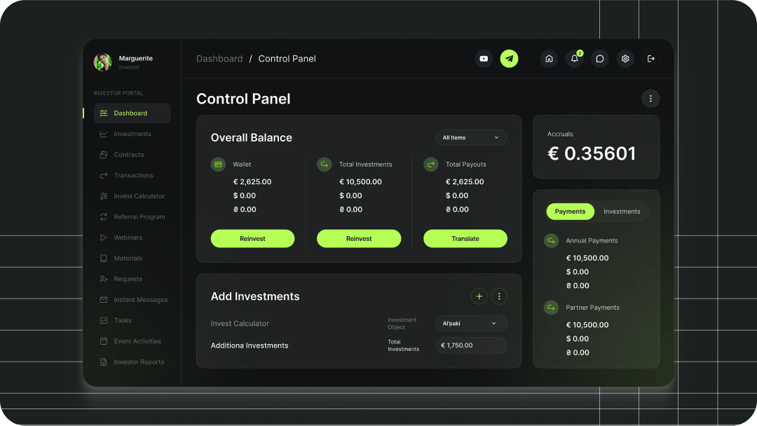
In most cases, blue is the dominant color. It represents trust, security, and professionalism — all qualities that matter in finance. Green is often used to indicate positive balances or completed transactions. Gray or muted tones make up the background, allowing key data to pop without overwhelming the user.
This approach creates a no-nonsense UI that communicates reliability and keeps the focus on the numbers. It also reduces visual fatigue for users who interact with the dashboard daily.

Read more: Why Every Business Should Have a Dashboard
VC dashboards are built for fast-paced decision-making. These tools often track deal flow, startup metrics, and portfolio performance. Users want a design that feels dynamic, modern, and high-tech.
Dark mode works well here. It gives off a sleek, data-driven feel and makes graphs, charts, and KPIs stand out. Bright colors like teal, purple, or orange are great for highlighting active rounds, performance spikes, or alerts. When used carefully, these accents can make dashboards feel alive and responsive.
The key is contrast. VC dashboards need to help investors scan and react quickly, and color is a big part of making that happen.
Real estate dashboards are often used by agents, brokers, and operations teams to track property listings, sales performance, and lead management. These users don’t need a complex UI — they need clarity, speed, and a sense of value.
Lighter color palettes work well here. Soft greens, earth tones, and clean white space keep the interface friendly and readable. Green fits perfectly with growth and land-related data, while navy or gold accents can hint at premium listings or high-value deals.
It’s all about creating a visual environment that feels inviting but still gets the job done. Agents don’t want to dig — they want to glance and act.

Beyond industry style, color should be intentional in every UI element. Let’s look at how to apply color across core components like notifications, KPIs, charts, and more — using smart defaults for each industry.
Red for overdue invoices, green for successful payments, blue for neutral status updates.
Orange or yellow for deal status changes, teal for success milestones, red for risks.
Light green for “Offer Accepted,” yellow for “Price Drop,” red for urgent listing alerts.
Green for profit, red for losses, gray for projections — all on a soft white background.
Dark cards with bright green for growth, purple for stage changes, red for warning signals.
Soft greens for conversion rates, yellow for open tasks, red for long-on-market alerts.
Blue for actuals, gray for forecasts, green for year-over-year growth.
High-contrast colors like orange and purple to show portfolio comparisons.
Green for available listings, gold for high-value sales, beige for inactive properties.
Tags like “Paid” in green, “Pending” in blue, “Overdue” in red.
“Active Round” in orange, “At Risk” in red, “Exited” in dark gray.
“Available” in green, “Under Offer” in yellow, “Sold” in red.
Dark blue for primary buttons, light gray for secondary. Red for destructive actions.
Vibrant teal or purple as primary, with minimal secondary styles. Red for deleting or exiting deals.
Green or navy primary actions like “Add Listing,” gold for upgrades, beige for soft links.
Use no more than 3 to 5 core colors across your UI, and always test for accessibility. Retool makes it easy to apply conditional colors to metrics, badges, and table rows — so you can build smarter UI that adapts in real time based on your data.
Color isn’t just a style choice — it’s a communication layer. When used with intention, it turns dashboards into tools that speak clearly and guide fast action.
Whether you're building for accounting, venture capital, or real estate, your color choices should reflect the mindset of the user and the context of the data. At Retoolers, we build dashboards that not only look clean but perform better through design-driven thinking.
At Retoolers, we help businesses create custom dashboards, admin panels, client portals, and full workflow automation solutions using Retool. From idea to execution, we’ve got the skills to make it happen.
Let’s build something great together — contact Retoolers today.
Looking to supercharge your operations? We’re masters in Retool and experts at building internal tools, dashboards, admin panels, and portals that scale with your business. Let’s turn your ideas into powerful tools that drive real impact.
Curious how we’ve done it for others? Explore our Use Cases to see real-world examples, or check out Our Work to discover how we’ve helped teams like yours streamline operations and unlock growth.
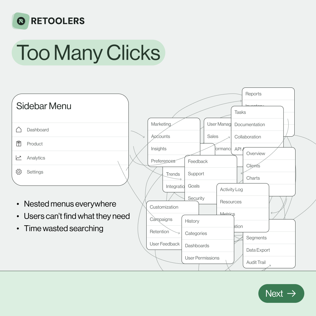
🔎 Internal tools often fail because of one simple thing: Navigation.
Too many clicks, buried menus, lost users.
We broke it down in this 4-slide carousel:
1️⃣ The problem (too many clicks)
2️⃣ The fix (clear navigation structure)
3️⃣ The Retool advantage (drag-and-drop layouts)
4️⃣ The impact (happier teams)
💡 With Retool, you can design internal tools that are easy to use, fast to build, and simple to maintain.
👉 Swipe through the carousel and see how better UX = better productivity.
📞 Ready to streamline your tools? Book a call with us at Retoolers.

🚀From idea → app in minutesBuilding internal tools used to take weeks.
Now, with AI App Generation in Retool, you can describe what you want in plain English and let AI do the heavy lifting.
At Retoolers, we help teams move faster by combining AI + Retool to create tools that actually fit their workflows.
👉 Check out our blog for the full breakdown: https://lnkd.in/gMAiqy9F
Before we quote, we help you clarify the workflow. Share your idea, process, or existing tools, and we’ll map the key requirements, suggest the right system, and create a free wireframe so you can see the solution before development starts.