Hieu Nguyen
April 16, 2025
•
15 mins read

Retool data visualization makes it easy to turn raw data into insights—without tools like Tableau
Retool charts, built on Plotly.js 2.34, give you 15 different chart types - from simple bar charts to complex pie charts - at a lower cost. Your data summaries through simple aggregations or interactive visualizations become easier with Retool’s chart-building features. Raw data transform into meaningful insights quickly.
Creating perfect visualizations can be challenging with different data types and transformation needs. This complete guide will help you become skilled at using Retool charts, from simple setup to advanced combinations. Let’s explore how to turn your data into compelling visual stories!
Retool’s chart components run on a unified architecture powered by Plotly.js version 2.34. This makes them both flexible and powerful. Many visualization tools hide complexity behind limited options. Retool takes a different approach by exposing Plotly’s full potential and adding user-friendly features.
Retool charts have two basic objects at their core: data and layout. Your actual information and chart configuration live in the data object. The layout object manages appearance settings like titles, legends, and margins. This matches Plotly’s native architecture, so developers can use their existing knowledge.
These components form the foundation of most Retool charts:

Retool shows the .selectedPoints array property when users interact with charts. This enables dynamic filtering and updates throughout your application.,
Retool gives you 15 differents chart types. Each serves specific visualization need:
This collection helps you find the right visualization to tell any data story
Creating effective visualizations requires understanding Retool’s chart system data flow. Charts can get data from three main sources: queries, transformers, or JavaScript.
The system works simply. You select a query or transformer in the Data source field and Retool fills your charts. Next, you map specific fields from your data to chart attributes. Series-based charts need X/Y data pairs, while categorical charts use Labels/Values pairs.
Your data source fields’ names appear in legends and tooltips by default. Retool picks chart names based on your data structure and grouping choices.

Built-in aggregation functions make Retool charts powerful. You can apply Sum, Average, Count, Min, Max, and seven other aggregation types when multiple Y values exist for one X data point. The Group by property segments data across dimensions. This works great for showing metrics like revenue by product or headcount by team.
JavaScript transformers help prepare data for your chart in complex scenarios. This gives you complete control over turning raw data into polished visualizations.
These fundamentals will help you build charts that display data accurately and tell compelling visual stories.
The quality of your data preparation makes or breaks effective visualizations with Retool charts. Bad data leads to poor charts - even the most sophisticated visualization can’t save poorly organized information.
Your data must follow specific patterns for Retool charts to display correctly. We organized chart data in an array of objects format, where each object shows a single data point or record. The key-value pairs in these objects become your axis values and data points.
These best practices will help you design your data structure:
SELECT * statements since they pull extra data that increases payload sizeA well-laid-out dataset has date, category, and value fields - ideal for time-series visualizations that break down by category.
Retool charts can get data from three main sources: queries, transformers, or JavaScript. Queries link straight to your data sources, while transformers help reshape and prepare that data for visualization.
These query optimization techniques boost performance:
Transformers shine at getting query results ready for visualization. These reusable Javascript code blocks can filter, sort, combine, and reshape your data. To name just one example, see how a transformer might filter unwanted records, normalize values, or merge multiple data sources.
A transformer example that filters based on user input:
const filteredData = formatDataAsArray(data).filter(
	obj => obj.first.includes({{ search.value }})
	);
return filteredData;Data aggregation techniquesBuilt-in aggregation capabilities in Retool charts automatically summarize your data. This feature helps when you have multiple Y values for a single X data point.
The available aggregation methods are:
The Group by property lets you combine serial data across multiple dimensions. This works great to visualize metrics like revenue by product over time.
Time-based visualizations need extra cate with date formatting and time zones. Retool might not recognize your data fields as actual at first, so you’ll need to transform them.
Here’s how to format dates properly:
This code formats dates for the x-axis:
.map(d => moment(d).format("YYY-MM-DD"))You can also filter time series data with components like daterangepicker. Users can adjust date ranges dynamically, creating interactive visualizations that respond to their selections.
Well-prepare data are the foundations of effective Retool charts. Structure your data carefully, use queries and transformers wisely, apply the right aggregation, and handle dates properly. This approach will help you create meaningful visualizations.

Let’s get hands-on and create real visualizations with Retool charts. We’ll move from theory into action.
You can create your first bar chart by dragging the Bar Chart component onto your canvas. The Bar Chart shows data in vertical bars and works great to compare categorical data. The inspector panel lets you select your data source and map your fields by setting X and Y data values.
Your bar chart’s appearance improves with these properties:
The isHiddenOnMobile property helps you create mobile-friendly visualizations. The toolbar configuration gives users ways to interact with your char through zoom, pan, and select options.
Pie charts show proportional data within a whole really well. Add the Pie Chart component to your canvas and set up your data source. Under “value labels”, pick the field that creates labels for each segment.
The pieDataHole property turns your pie chart into a donut chart by setting the hold depth from 0-1. You’ll likely need a dataset with an aggregation method like Sum to count category occurrences.
To name just one example, see how device manufacturers from an API response need raw data transformation into an array of objects with manufacturer names. Retool then adds up the occurrences of each manufacturer automatically.
Line charts are perfect at showing data changes over time. Add the Line Chart component, pick your data source, and set X data (usually dates) and Y data (values to track). Different lines appear for various categories with the “Group by” setting.
Line Charts come with these helpful properties:
Users can focus on specific time periods with the rangeSlider property, which makes finding trends easier.
Your data source fields automatically provide chart data series names that show up in legends and tooltips. Note that scripts working with components use a copy of the components object. Setting properties like chart1.dataseries[x].visible = false won’t change the component.
You should create a new dataseries variable with your chart’s Plotly JSON field value. Make your changes and return that dataseries to update the chart. When transformers serve as data sources, series names come from your data structure and grouping choices.
The Mixed Chart component lets you blend two different chart types. This makes it possible to show related metrics with different scales or formats in one view.
Retool charts reveal their true potential when you become skilled at customization. Your basic visualizations can evolve into professional, interactive dashboards that have a real effect.
You can create visually striking charts in Retool through multiple methods. The Spacing and Appearance sections in the Inspector let you adjust your visualization’s presentation. The Styles setting offers deeper customization to match your brand identity with color, fonts, and text styles.
Chart backgrounds can change through the plot_bgcolor and paper_bgcolor in Plotly JSON mode. This technique creates transparent backgrounds that blend naturally with your application design:
{
	"paper_bgcolor": "rgba(0,0,0,0)",
	"plot_bgcolor": "rgba(0,0,0,0)"
}Static charts become powerful analytical tools with interactivity. The .selectedPoints array property activates when users interact with your charts. Your charts can filter, transform, or update other components based on selections.
The system also lets you configure event handlers for various user actions:
Your charts turn into dynamic data entry points by connecting these events to queries or transformers.
Tooltips add context and detail without visual clutter. The Add-ons setting supports their addition along with legends, data labels, and toolbars.
Different chart types need different tooltip customization approaches. Pie charts require “hovertemplate” property adjustment:
"hovertemplate": "<b>%{label}</b><br>Value: %{value}<extra></extra>"Line charts can display multiple series in one tooltip. Just enable the ‘Use array’ checkbox and pass custom strings for each data point.
Mobile-friendly visualizations need careful design consideration. The aspectRatio property helps maintain proper proportions on different screen sizes. Most designers use like 1.33 (4:3) or 1.78 (16:9).
Retool’s standard chart components don’t resize automatically for smartphones. You might want to:
A well-designed visualization communicates effectively on any device. Charts should stay simple and focused for mobile users.
You’re ready to explore advanced techniques after learning the simple aspects of Retool charts. These methods help create sophisticated visualizations that lead to better decisions.

The Mixed Chart component serves as Retool’s solution to combine different chart types on a single canvas. This tool displays data on an x-axis with multiple y-axes and helps visualize relationships among several datasets effectively. To cite an instance, revenue bars can appear with customer growth lines - showing context that separate charts would miss.
The Mixed Chart lets you do more than standard charts:
Retool’s Plotly JSON Chart component offers ultimate customization. This advanced option builds charts with raw Plotly JSON structured data that standard presets might not cover.
The component needs two key elements:
Custom charts give you access to advanced features like annotations, trendlines, and integrated UI buttons. The tool exposes API methods like plotlyJsonChart.scrollIntoView() and plotlyJsonChart.setHidden() that provide programmatic control.
Interactive dashboards come alive as charts respond to user interactions. Charts update automatically when users select data points in connected visualizations.
Business intelligence dashboards can connect multiple data sources and show complex relationships across sales, revenue, and marketing metrics. Teams track KPIs and make informed decisions without switching between different tools.
Advanced Retool charts shine brightest through their shared capabilities. They create a unified analytics experience that turns raw data into applicable information.
Retool charts offer powerful tools that turn complex data into meaningful visualizations at a fraction of traditional BI solutions’ cost. These charts become vital parts of any evidence-based application through proper data preparation, thoughtful customization, and strategic implementation of interactive features.
The charts’ flexibility lets you combine different types and create custom visualizations with Plotly JSON that meet your specific needs, whatever the complexity. Professional-looking dashboards work smoothly on all devices thanks to built-in mobile responsiveness and extensive customization options.
Note that successful data visualization requires clean, well-laid-out data and clear objectives. You should begin with simple charts, become skilled at the fundamentals, and then explore advanced features like Mixed Charts and custom Plotly implementations. Your path to creating perfect visualizations with Retool charts starts here. Retool data visualization gives your team a fast, cost-effective way to build powerful insights into your app or dashboard experience.
At Retoolers, we help businesses create custom dashboards, admin panels, client portals, and full workflow automation solutions using Retool. From idea to execution, we’ve got the skills to make it happen.
Let’s build something great together — contact Retoolers today.
Looking to supercharge your operations? We’re masters in Retool and experts at building internal tools, dashboards, admin panels, and portals that scale with your business. Let’s turn your ideas into powerful tools that drive real impact.
Curious how we’ve done it for others? Explore our Use Cases to see real-world examples, or check out Our Work to discover how we’ve helped teams like yours streamline operations and unlock growth.
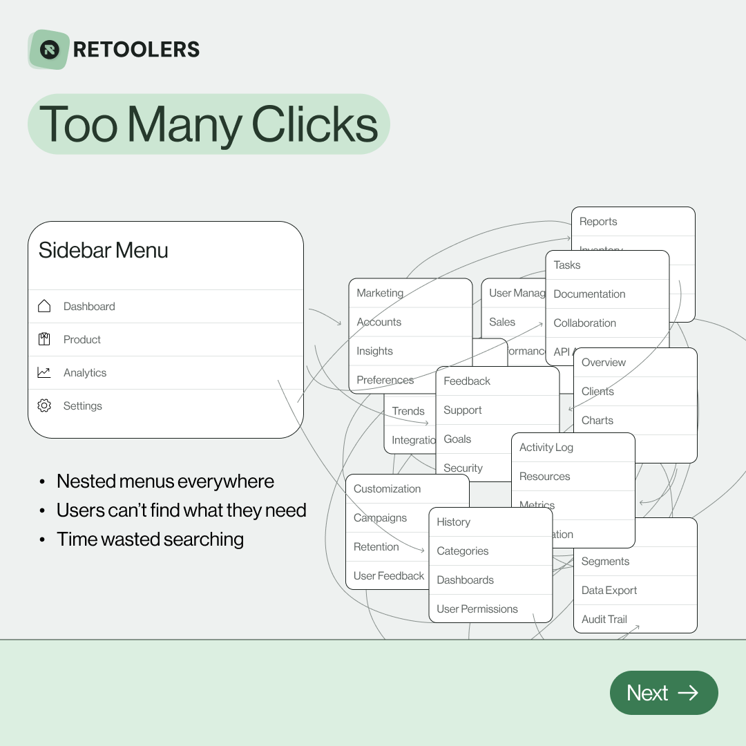
🔎 Internal tools often fail because of one simple thing: Navigation.
Too many clicks, buried menus, lost users.
We broke it down in this 4-slide carousel:
1️⃣ The problem (too many clicks)
2️⃣ The fix (clear navigation structure)
3️⃣ The Retool advantage (drag-and-drop layouts)
4️⃣ The impact (happier teams)
💡 With Retool, you can design internal tools that are easy to use, fast to build, and simple to maintain.
👉 Swipe through the carousel and see how better UX = better productivity.
📞 Ready to streamline your tools? Book a call with us at Retoolers.

🚀From idea → app in minutesBuilding internal tools used to take weeks.
Now, with AI App Generation in Retool, you can describe what you want in plain English and let AI do the heavy lifting.
At Retoolers, we help teams move faster by combining AI + Retool to create tools that actually fit their workflows.
👉 Check out our blog for the full breakdown: https://lnkd.in/gMAiqy9F
As part of our process, you’ll receive a FREE business analysis to assess your needs, followed by a FREE wireframe to visualize the solution. After that, we’ll provide you with the most accurate pricing and the best solution tailored to your business. Stay tuned—we’ll be in touch shortly!