Duy Vu
September 11, 2025
•
10 mins read

When companies think about efficiency, they often look at features, automation, or integrations. What usually gets overlooked is user experience (UX). Internal tools — dashboards, admin panels, reporting apps — are supposed to save time and drive clarity. But when they’re clunky, confusing, or visually overwhelming, they silently drain productivity. People avoid them, struggle with onboarding, and make more mistakes than they should. This “bad UX tax” adds up, and most companies never calculate it. The truth is, good UX in internal tools isn’t just about making things look nice. It directly impacts onboarding speed, error rates, employee adoption, and ultimately the return on investment (ROI) of the software itself.
If you’ve ever sat next to a new hire trying to figure out a dashboard, you’ve seen the cost of bad UX firsthand. Training drags out because the interface feels like a maze. The employee hesitates before clicking buttons, afraid of making a mistake. Instead of empowering them, the tool creates friction. Multiply that by every new hire, and onboarding time balloons.
Another cost comes in the form of errors. Finance teams using messy reporting dashboards often export data into Excel just to feel safe. Operations teams misinterpret confusing status fields. Support teams spend more time figuring out the tool than helping customers. Each mistake may seem small, but over time, errors add up to thousands in wasted hours and missed revenue.
Then there’s abandonment. Employees will revert to tools they understand — spreadsheets, Slack, even email chains — instead of using the official dashboard. That’s wasted investment. The company built or bought the tool, but it sits underutilized because the UX isn’t inviting or intuitive. It’s like buying a new gym membership and never showing up because the machines are too confusing to use.
Good UX flips the story. When tools are clean, clear, and aligned with how teams actually work, efficiency spikes. One of the most measurable outcomes is onboarding. With a well-designed dashboard, new hires can reach full productivity in days instead of weeks. Instead of a manager spending hours training, they can hand over the tool and watch the employee pick it up naturally. That translates directly to faster ramp-up and less overhead.
Error reduction is another huge ROI factor. A streamlined, intuitive design reduces misclicks and misinterpretations. For a finance team, that might mean fewer discrepancies in month-end reporting. For an ops team, it could mean fewer inventory mismatches. Each avoided mistake is a hidden saving.
Adoption rates also soar with better UX. If a dashboard feels smooth to use, employees stick with it instead of switching back to Excel. Adoption means the company actually extracts the value it intended when building or buying the tool. Without good UX, even the most powerful features go unused. With good UX, even basic features can transform workflows.
Finally, there’s employee morale. People genuinely feel frustrated when tools slow them down. A smooth interface reduces stress, builds confidence, and makes work more enjoyable. While morale is hard to measure, it ties back into retention. Employees who don’t feel stuck fighting with bad software are less likely to churn.
Consider a finance team struggling with reporting errors. Their internal dashboard had multiple filters hidden under dropdowns, inconsistent labels, and a cluttered data table. By redesigning it with a cleaner UI — clear column headers, a dedicated filter panel, and visual cues for anomalies — error rates dropped by nearly 30%. The redesign didn’t add new features. It simply made the existing ones usable.
An operations team had a logistics dashboard that took two weeks for new hires to master. After a redesign focusing on clear hierarchy, better spacing, and context-driven tooltips, onboarding time was cut in half. That meant managers spent less time training and more time optimizing processes.
A customer support team resisted adopting a Retool dashboard because it felt intimidating. After simplifying the layout, grouping actions by workflow, and using consistent colors to indicate statuses, adoption jumped. Within a month, 80% of tickets were being managed inside Retool instead of fragmented across email and spreadsheets.
These aren’t one-off wins. They illustrate a pattern: every time internal tools are designed with UX in mind, companies gain efficiency, save time, and reduce costly friction.
One overlooked truth is that UX scales. A poorly designed tool causes a little pain with five users. With fifty, it’s chaos. With five hundred, it’s a nightmare. On the flip side, a well-designed tool scales beautifully. The clearer the design, the easier it is to roll out to more teams and more regions without training bottlenecks.
This is why UX should be seen as a growth multiplier, not just a design “expense.” When you invest in UX early, every new employee benefits. Every new feature adoption becomes smoother. Every team gets more leverage from the same tool.
Think of it like infrastructure. Just as companies invest in fast internet or secure servers because they know it scales, investing in UX has the same effect. It compounds. Each hour saved or mistake avoided isn’t just one small win — it multiplies across the entire organization.
At Retoolers, we’ve seen first-hand how UX can make or break adoption. We don’t just build dashboards; we design them to fit naturally into workflows. That means:
We also pay attention to industry-specific UX needs. For example, in our blog How Real Estate Firms Save 10 Hours per Week with Retool, we showed how clean dashboards helped teams centralize data and avoid repetitive tasks. That wasn’t just about functionality — it was about designing workflows that teams wanted to use.
Another example comes from AI. In AI-Powered Customer Support Dashboards in Retool, we highlighted how AI can triage tickets and draft responses. But the key to adoption wasn’t just AI integration. It was creating an intuitive UI where agents trusted the output and felt in control.
Our approach is simple: combine technical capability with thoughtful design, so companies don’t just get tools — they get adoption, speed, and measurable ROI.
The biggest ROI drivers in business aren’t always flashy. Sometimes, they’re invisible. Good UX in internal tools is one of them. It’s the difference between employees struggling and employees thriving. It’s the difference between dashboards that collect dust and dashboards that become indispensable.
Companies that see UX as “optional” are paying a silent tax: longer onboarding, more errors, lower adoption. Companies that invest in UX are unlocking hidden returns: faster ramp-ups, fewer mistakes, and happier employees.
The message is simple. Stop thinking of UX as decoration. Start thinking of it as infrastructure. If your internal tools are slow, confusing, or underused, it’s time to rethink the design.
Are you ready to unlock ROI with better-designed dashboards? Book a call
Looking to supercharge your operations? We’re masters in Retool and experts at building internal tools, dashboards, admin panels, and portals that scale with your business. Let’s turn your ideas into powerful tools that drive real impact.
Curious how we’ve done it for others? Explore our Use Cases to see real-world examples, or check out Our Work to discover how we’ve helped teams like yours streamline operations and unlock growth.
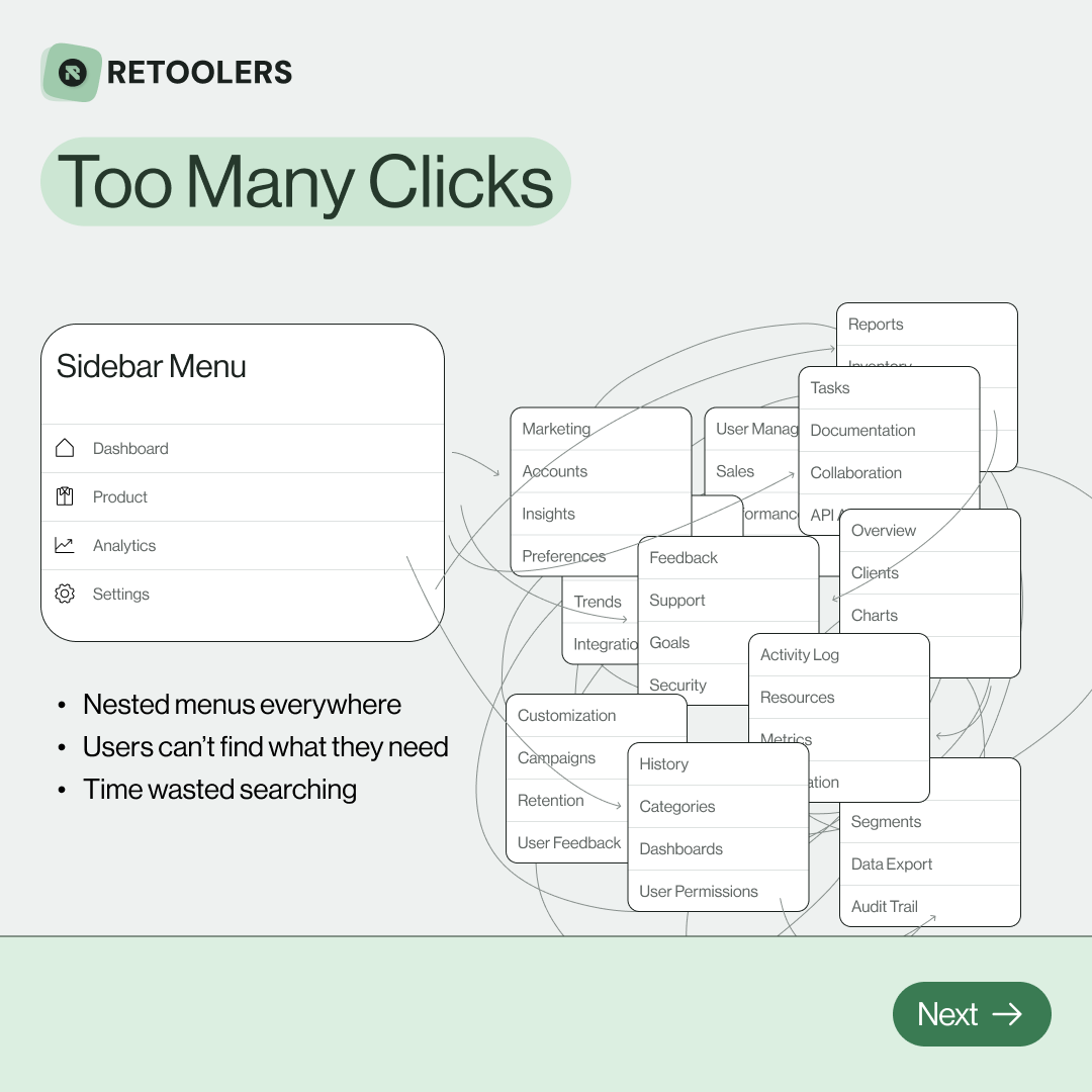
🔎 Internal tools often fail because of one simple thing: Navigation.
Too many clicks, buried menus, lost users.
We broke it down in this 4-slide carousel:
1️⃣ The problem (too many clicks)
2️⃣ The fix (clear navigation structure)
3️⃣ The Retool advantage (drag-and-drop layouts)
4️⃣ The impact (happier teams)
💡 With Retool, you can design internal tools that are easy to use, fast to build, and simple to maintain.
👉 Swipe through the carousel and see how better UX = better productivity.
📞 Ready to streamline your tools? Book a call with us at Retoolers.
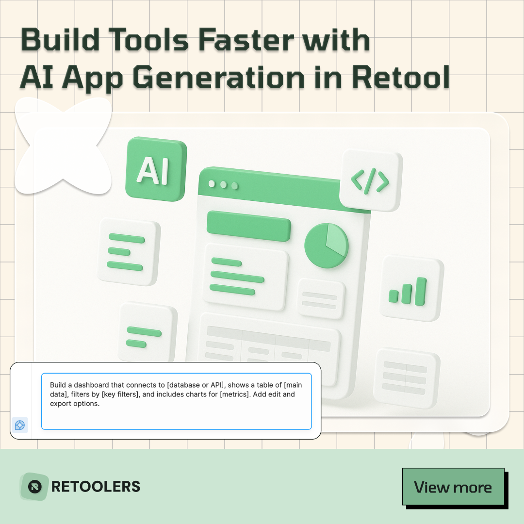
🚀From idea → app in minutesBuilding internal tools used to take weeks.
Now, with AI App Generation in Retool, you can describe what you want in plain English and let AI do the heavy lifting.
At Retoolers, we help teams move faster by combining AI + Retool to create tools that actually fit their workflows.
👉 Check out our blog for the full breakdown: https://lnkd.in/gMAiqy9F
Before we quote, we help you clarify the workflow. Share your idea, process, or existing tools, and we’ll map the key requirements, suggest the right system, and create a free wireframe so you can see the solution before development starts.