Duy Vu
December 11, 2024
•
15 min read

When working with data in Retool, the way it’s displayed can make a huge difference. Color coding is a smart way to simplify complex datasets, highlight key details, and make your dashboards more user-friendly. Let’s explore why color coding matters, some creative ways to use it, and the benefits it can bring to your workflow.
Color-coded tables aren’t just about making things look nice—they add serious functionality to your dashboards. Here’s why they’re worth using:

Not sure how to start? Here are some practical ideas to apply color coding effectively:

Adding color coding to your Retool tables offers several benefits:

Color coding is a simple yet powerful feature that makes your Retool dashboards smarter and more functional. By highlighting key metrics, organizing data, and creating clear visual cues, you’ll save time, reduce errors, and make better decisions. Start experimenting with color coding today and see how it transforms the way you work with data!
At Retoolers, we specialize in helping businesses like yours create powerful internal tools using Retool. Whether you need a custom dashboard, an admin panel, or a complete workflow automation solution, we've got the expertise to bring your ideas to life.
Get in touch with us today to see how we can help you optimize your operations with Retool. Contact Retoolers and let’s get started!
Looking to supercharge your operations? We’re masters in Retool and experts at building internal tools, dashboards, admin panels, and portals that scale with your business. Let’s turn your ideas into powerful tools that drive real impact.
Curious how we’ve done it for others? Explore our Use Cases to see real-world examples, or check out Our Work to discover how we’ve helped teams like yours streamline operations and unlock growth.
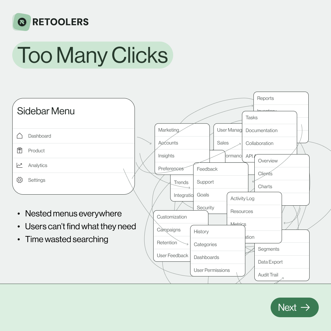
🔎 Internal tools often fail because of one simple thing: Navigation.
Too many clicks, buried menus, lost users.
We broke it down in this 4-slide carousel:
1️⃣ The problem (too many clicks)
2️⃣ The fix (clear navigation structure)
3️⃣ The Retool advantage (drag-and-drop layouts)
4️⃣ The impact (happier teams)
💡 With Retool, you can design internal tools that are easy to use, fast to build, and simple to maintain.
👉 Swipe through the carousel and see how better UX = better productivity.
📞 Ready to streamline your tools? Book a call with us at Retoolers.
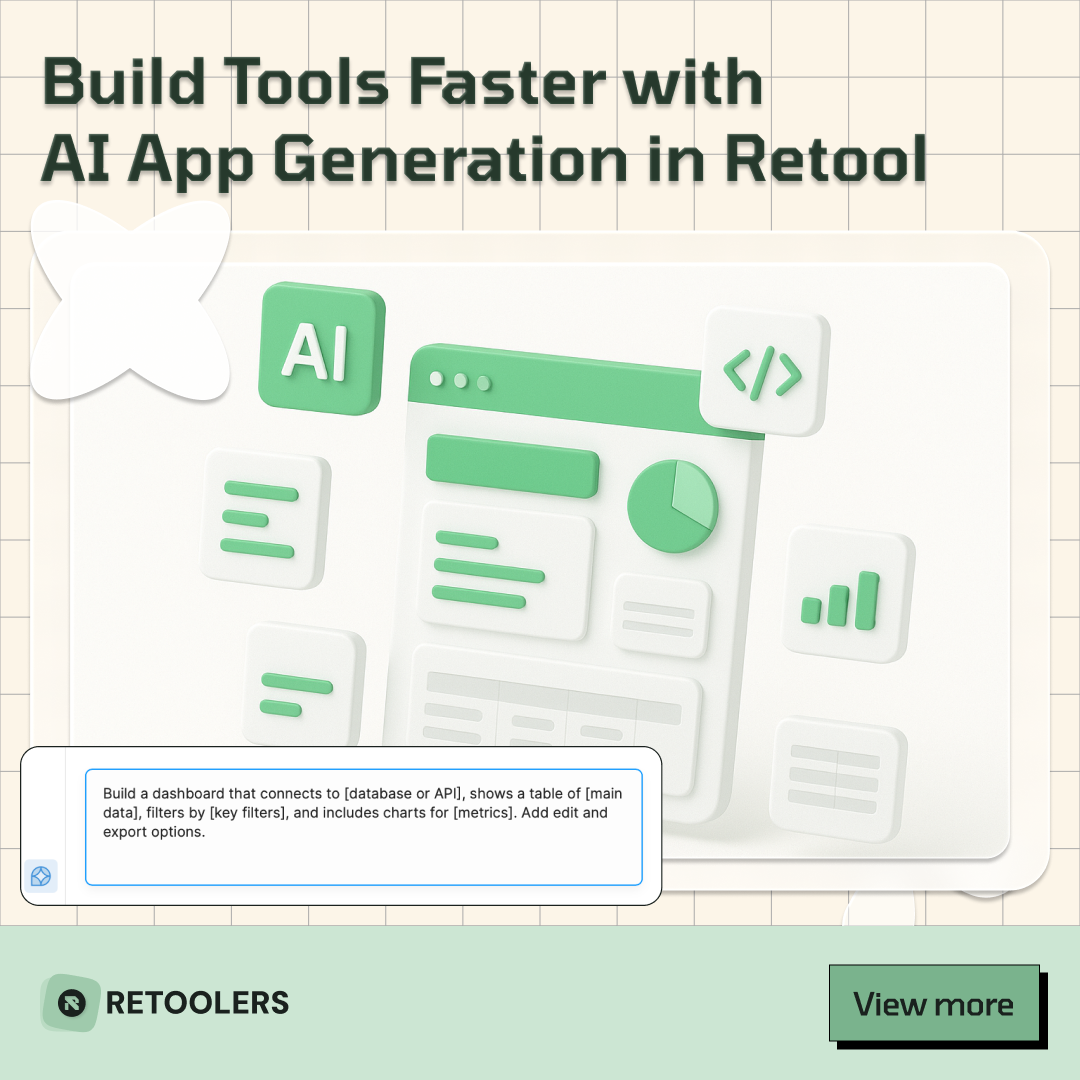
🚀From idea → app in minutesBuilding internal tools used to take weeks.
Now, with AI App Generation in Retool, you can describe what you want in plain English and let AI do the heavy lifting.
At Retoolers, we help teams move faster by combining AI + Retool to create tools that actually fit their workflows.
👉 Check out our blog for the full breakdown: https://lnkd.in/gMAiqy9F
Before we quote, we help you clarify the workflow. Share your idea, process, or existing tools, and we’ll map the key requirements, suggest the right system, and create a free wireframe so you can see the solution before development starts.