Duy Vu
February 11, 2026
•
29 mins read

When teams talk about Retool, the conversation almost always starts with internal tools. Admin dashboards, ops panels, internal workflows, and data heavy systems are where Retool feels most natural. It is fast to build, flexible, and powerful for teams that live inside the product every day.
But as companies grow, another question shows up quickly. Can Retool handle external users? Client portals, partner dashboards, vendor tools, or customer facing internal systems that suddenly are no longer internal.
This is where performance and UX matter much more than people expect. External users behave differently. They use different devices, different operating systems, and they compare your app to polished SaaS products they already trust. A small delay that internal users tolerate can feel broken to a client.
This article breaks down what performance and UX considerations really apply to external users when using Retool. It explains where problems actually come from, when Retool works perfectly fine, and when you should think twice. The goal is not to scare you away from Retool, but to help you use it correctly.
Internal users are predictable. They usually work on company managed laptops, often modern MacBooks, with updated browsers and stable internet connections. They use the tool daily, so even if something feels a little slow, they accept it because the tool helps them do their job.
External users are the opposite. They come from anywhere. Old Windows laptops, low RAM machines, different screen sizes, outdated browsers, and sometimes unreliable internet. They do not care how fast you built the tool or how powerful it is under the hood. They only care about how it feels.
This difference alone changes how you should think about UX. An internal admin panel can be dense, packed with controls, and optimized for power users. A client portal must be calm, focused, and easy to understand. When teams reuse the same design mindset for both, performance and UX issues start to appear.
Retool runs in the browser. It renders components, fetches data, runs logic, and updates the UI on the client side. On modern browsers and modern hardware, this works extremely well. Interactions feel smooth, data loads quickly, and complex workflows are handled without issues.
Retool is clearly optimized for modern environments, especially MacOS with Chrome or Safari. This is not a secret and it is not a flaw. It simply reflects where most internal users work.
Problems usually appear when heavy UI meets weaker devices. That is when people say Retool feels slow or janky. In reality, Retool is doing exactly what it is supposed to do, but the environment cannot keep up.
This part is important. Most performance complaints are not caused by Retool itself. They are caused by how the app is designed.
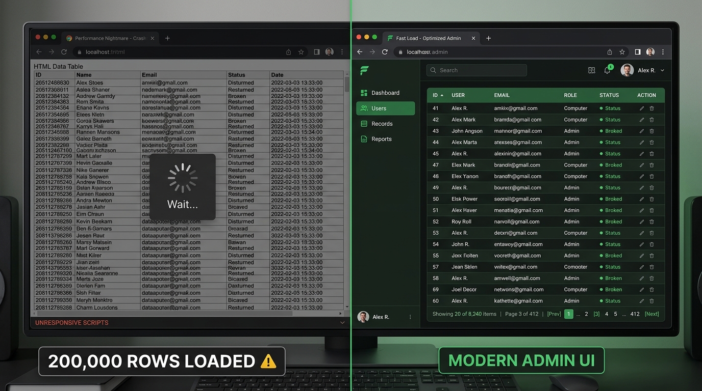
When a page is filled with dozens of components, large tables loading thousands of rows, multiple charts updating at the same time, nested containers, and queries firing all at once, the browser has to work very hard. On a modern Mac, this might still feel okay. On an older Windows machine, it quickly becomes painful.
External users feel this immediately. The UI may stutter when scrolling, inputs may lag, and the app can feel unstable even if nothing is technically broken. This is not a Retool problem. It is a UI weight problem.
The performance issue we see most often in real Retool projects is not a single bad query. It is hidden UI debt. Teams build a V1, then a V2, then a test flow, then a temporary modal, then a second version of the same table. When the feature is replaced, they do not actually remove the old components. They hide them.
That feels harmless in the moment. A developer thinks, “If we need it later, I will not have to rebuild the whole thing.” But dragging a component again is easy. Carrying every old component forever is what makes the app heavier over time.
Hidden containers, old modals, disabled sections, unused filters, and abandoned V2 experiments still increase the size of the app. Tabs can create the same problem. A tabbed interface may look clean to the user, but if every tab holds tables, inputs, charts, modals, and nested tabs, the app has still become one large surface for Retool and the browser to manage.
This matters much more for external users than internal users. Internal tools can be dense because trained users need power and control. External apps should usually do less per screen. A client portal, vendor dashboard, or partner workflow should carry only the components needed for the current job.
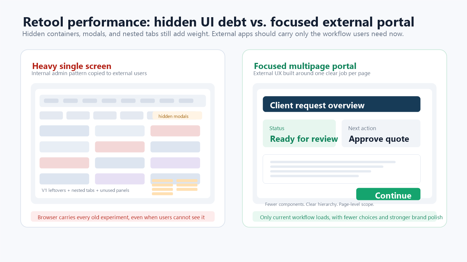
A useful audit is simple: open the component tree and ask which components exist because the current workflow needs them, and which exist because nobody wanted to delete them. If a hidden component belongs to an old experiment, remove it. If a modal is no longer part of the flow, remove it. If a tab only exists as storage for a future idea, document the idea elsewhere and delete the UI.
Multipage Retool apps are useful because they create a real structural boundary between workflows. Instead of placing every feature inside one giant tabbed container, each page can own a smaller set of components, queries, and interactions.
Retool’s own multipage guidance is aligned with this pattern: multipage apps defer work for other pages until those pages are focused, and Retool has described performance improvements for large apps when only the current page is evaluated. That does not mean multipage automatically fixes a badly designed app. A single overloaded page can still feel slow. But it gives teams a better default architecture than piling every workflow into tabs.
For external portals, a good rule is one major job per page. A customer should not land on a page that contains onboarding, billing, documents, admin settings, chat, reports, and support history hidden behind nested tabs. Split those into pages with clear navigation. The experience feels smoother because users see less at once, and the app is easier for the team to maintain.
Queries still matter. Too many queries running on page load, unpaginated tables, repeated requests for the same data, and large client-side transformations can absolutely make an app feel slow. Retool also adds a small amount of query overhead because it downloads results, transforms data, assigns values to components, and updates dependencies.
But teams often jump to query optimization before they audit the UI. That can waste time. If the app feels heavy before the user can even do anything, or if opening modals and switching tabs feels laggy, the first question should be: how many components are sitting in this app, including the hidden ones?
The better audit separates the problem into two buckets. First, UI weight: component count, nested containers, hidden leftovers, large tables, modals, and tab structure. Second, data work: page-load queries, repeated queries, cache strategy, pagination, and backend logic. You need both, but for external UX the UI-weight audit is usually the fastest win.
It is important to be honest about device differences. Retool feels best on MacOS with modern browsers. That is where it shines. On Windows, especially older builds or lower spec machines, heavy UIs are less forgiving.
This does not mean Retool does not work on Windows. It does. But the margin for bad design is smaller. If your external users are mostly on modern devices, Retool will feel fine. If your audience includes legacy systems, you must design with performance in mind from day one.
Ignoring this reality is where teams get into trouble. Blaming the tool does not fix the problem.
External users do not want to learn your system. They want it to make sense instantly. They expect clear navigation, fast load times, and smooth interactions.
One of the biggest mistakes teams make is shipping internal admin UX directly to clients. Internal tools prioritize control and flexibility. External tools must prioritize clarity and confidence.
When a client sees too many controls, too many filters, or too much data at once, they feel overwhelmed. When the app feels slow on first load, trust drops immediately. Performance and UX are deeply connected for external users.
The good news is that most performance and UX issues are easy to avoid. The solution is not technical wizardry. It is restraint.
External facing Retool apps should use fewer components per screen, larger spacing, and clearer hierarchy. Workflows should be broken into steps instead of crammed onto one page. Tables should load only the data users actually need. Charts should be simple and purposeful.
When you design your Retool app like a product instead of an admin panel, performance improves naturally. The UI becomes lighter, easier to understand, and more stable across devices. Retool handles this type of experience very well.
Performance is not only measured in milliseconds. It is also felt through layout, typography, spacing, color, and confidence. A cluttered screen feels slower because users need more effort to understand what they are looking at. A calm screen feels faster because the next action is obvious.
Retool’s default UI is functional, but external users compare your portal to modern SaaS products, not to internal admin tools. Small design changes can make a large difference. Increase default font sizes by one or two pixels when the app feels cramped. Use a stronger typeface such as Satoshi or Spectral when the brand calls for it. Use color intentionally instead of leaving every button, label, and state in the default style.
This does not mean overdesigning the app. It means giving the interface enough visual hierarchy that users trust it. A clear title, readable body text, consistent button styles, and calm brand colors can make a Retool app feel more polished without slowing delivery.
Retool is a strong choice for external users when the UI is intentionally simple, the audience uses relatively modern devices, and speed of development matters. It works especially well for client portals, partner dashboards, vendor tools, and operational interfaces where clarity is more important than visual polish.
If you are not deeply concerned about supporting very old devices or extremely complex animations, Retool is usually more than enough. Many successful client facing tools are already built this way.
There are cases where Retool is not ideal. If your external users rely heavily on legacy hardware, if you need advanced frontend animations, or if you require full control over every pixel and interaction, a custom frontend might be a better option.
This does not mean Retool failed. It simply means every tool has a context where it performs best.
Retool is not slow by default. Poor UI decisions make it feel slow. For external users, performance and UX are shaped far more by design choices than by the platform itself.
If you keep your UI light, focused, and user friendly, Retool can power external client portals very well. If you overload the interface, hide old features instead of removing them, and ignore device reality, the experience will suffer.
Know your users, design with intention, and Retool will do its job. If you want help designing or building a Retool based client portal that feels fast and professional for external users, Retoolers can help you get it right from day one. Get a Quote
Looking to supercharge your operations? We’re masters in Retool and experts at building internal tools, dashboards, admin panels, and portals that scale with your business. Let’s turn your ideas into powerful tools that drive real impact.
Curious how we’ve done it for others? Explore our Use Cases to see real-world examples, or check out Our Work to discover how we’ve helped teams like yours streamline operations and unlock growth.

Before we quote, we help you clarify the workflow. Share your idea, process, or existing tools, and we’ll map the key requirements, suggest the right system, and create a free wireframe so you can see the solution before development starts.